Overview
The davinci platform creates a simple way to create interactive, dynamic visualizations of data and data relationships. Relationships are specified in a simple declarative manner, and the platform automatically pushes changes in data to the necessary charts, graphs or code that depends on it.
The demonstrations here show simple ways to create live, dynamic relationships in your desktop, web pages or other documents.
To see how dynamic updating can be used to automate documentation, please see document automation.
Video Demos and Tutorials

Moving Average
The moving average example calculates a moving average of a given time series, based on the
value of a slider control.
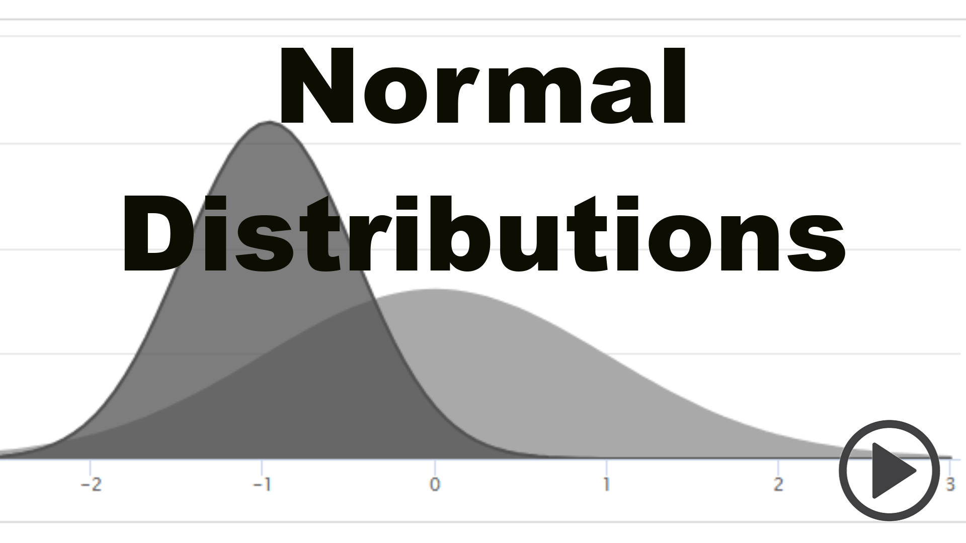
Normal Distributions
The normals chart displays two normal distributions with different standard deviations. A slider
control adjusts the expected value of one of the normals.